
DesignMode24 Interior Design is a design approach built around the 70/30 layout rule, a method that splits a room into a calm, dominant base and a smaller layer of bold accents. This simple ratio guides material choices, furniture placement, and color decisions so every space feels planned rather than random.
Most rooms fail for one of two reasons: they feel flat, or they feel cluttered. DesignMode24 solves this with a ratio so precise yet so simple that anyone can use it, no design degree required. It’s the same quiet trick behind rooms that get saved, shared, and copied online.
Beyond the basic ratio, DesignMode24 Interior Design applies this thinking to materials, asymmetry, entryways, and even smart home devices, turning one rule into a full design system. The sections ahead break down exactly how this ratio works in real rooms, with practical steps you can apply in your own home starting today.
What Is the 70/30 Rule in DesignMode24 Interior Design?
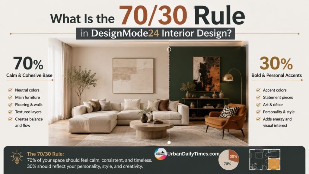
At its core, the 70/30 rule divides a room into two visual categories based on how much attention each part should command.
- 70% of the room forms the dominant, cohesive base — walls, flooring, large furniture, and the overall color story.
- 30% of the room is reserved for accent elements — bold textures, contrasting colors, statement decor, and personality-driven details.
This isn’t about literally measuring square footage with a tape measure. It’s a proportional way of thinking about visual weight. When a designer at DesignMode24 walks into a blank room, they start by asking: what will anchor this space, and what will give it energy?
Why the ratio matters more than the exact numbers
The specific percentages matter less than the underlying principle: contrast needs a majority and a minority to work. A room split evenly down the middle (50/50) often feels indecisive, with no clear focal point. A room that’s too monochromatic can feel safe but forgettable.
| Design Ratio | Visual Effect | Best For |
|---|---|---|
| 90/10 | Very calm, minimal contrast | Bedrooms, meditation spaces |
| 70/30 | Balanced, visually engaging | Living rooms, kitchens, entryways |
| 50/50 | Can feel busy or unresolved | Rarely recommended |
| 60/30/10 | Adds a tertiary accent layer | Color-heavy schemes |
DesignMode24 typically favors 70/30 over the more common 60/30/10 color rule because it simplifies decision-making — especially for homeowners who find too many variables overwhelming.
How designers apply it in practice
- Identify the room’s primary function and mood.
- Choose the dominant material, tone, or style for the 70% base.
- Select two or three accent elements for the 30%.
- Test the balance by stepping back and checking whether one zone visually competes with the other for attention.
How DesignMode24 Applies Material Choices to the 70% Side of a Room
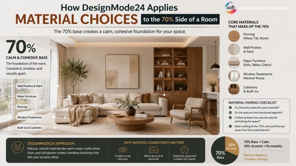
The 70% base isn’t just about color — it’s about materials, texture, and finish consistency. This is where many DIY room makeovers go wrong. People focus on paint swatches and forget that flooring, cabinetry, and large upholstery all belong to the same dominant layer.
Core materials that typically make up the 70%
- Flooring (hardwood, tile, or large-format stone)
- Wall finishes and paint
- Major furniture pieces like sofas, beds, and dining tables
- Window treatments in neutral tones
- Cabinetry and built-ins
DesignMode24’s approach leans toward natural, neutral materials for this portion — think warm oak, matte stone, linen, and soft plaster textures. These choices create a backdrop that won’t compete with whatever bold statement comes next.
Why material consistency beats color matching
A common misconception is that the 70% base needs to be a single color. In reality, it needs to be a consistent material language. A room can mix beige walls, light wood flooring, and a cream sofa without ever repeating the exact same shade twice — because the materials share warmth, texture, and undertone.
This is a subtle but important distinction: matching colors can feel sterile, while matching material character feels curated. It’s the difference between a showroom and a lived-in home.
A simple material-pairing checklist
- Do the tones share the same warmth (all warm or all cool)?
- Do the textures feel intentional together (matte with matte, or matte with a touch of gloss)?
- Is there at least one natural material anchoring the space (wood, stone, linen)?
- Does nothing in the 70% zone pull the eye away from the eventual accent pieces?
Why Asymmetry Works Better Than Matching Sets
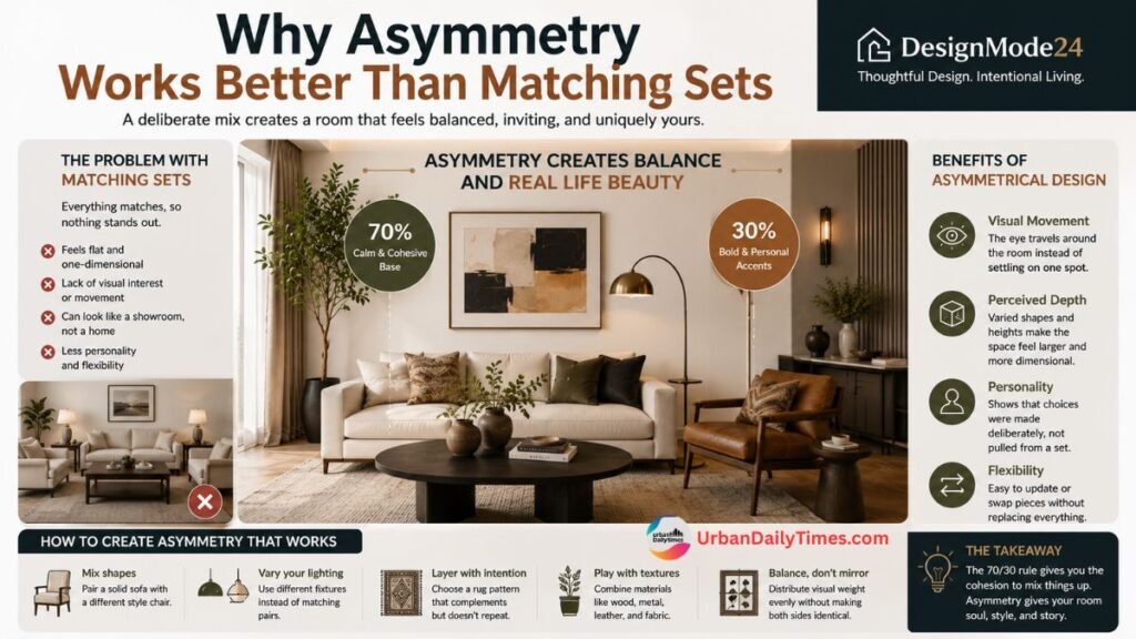
One of the more distinctive habits in DesignMode24’s portfolio is a deliberate avoidance of matching furniture sets. Instead of a sofa, loveseat, and armchair all upholstered in identical fabric, their rooms often pair one substantial anchor piece with something visually lighter and different in shape.
The problem with matched sets
Matching furniture collections were a hallmark of catalog-style decorating for decades. The issue is that a fully matched set can flatten a room’s visual hierarchy — everything demands equal attention, so nothing actually stands out. It can also make a space feel more like a furniture showroom than a home shaped by its occupants.
What asymmetry looks like in practice
- Pairing a solid, neutral sofa with an accent chair in a contrasting material (leather with boucle, for example)
- Using two different but complementary lighting fixtures instead of a matching pair
- Choosing a rug pattern that doesn’t repeat any other pattern in the room, yet shares a color note
Benefits of an asymmetrical layout
- Visual movement – the eye travels around the room instead of settling on one flat plane.
- Perceived depth – varied shapes and heights make a room look larger and more dimensional.
- Personality – asymmetry signals that choices were made deliberately, not pulled from a single showroom bundle.
- Flexibility – individual pieces can be swapped or updated without needing to replace an entire matched set.
This is where the 70/30 rule and asymmetry intersect: the 70% base provides enough cohesion that the room can tolerate — and benefit from — mismatched shapes and textures in the remaining 30%.
Applying the Rule to Smart Home and Entryway Layouts
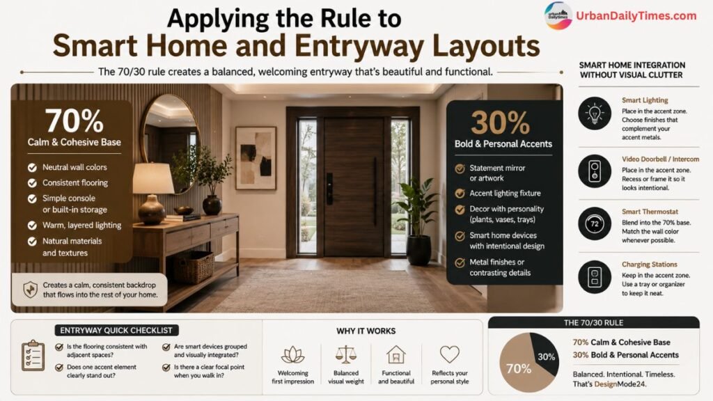
The 70/30 rule isn’t limited to living rooms and bedrooms. DesignMode24 frequently applies the same logic to entryways and smart home layouts, two spaces that are often overlooked in traditional design advice but see heavy daily use.
Entryways: first impressions built on the ratio
An entryway sets the tone for the entire home, and it’s often the smallest space with the biggest visual impact. Applying 70/30 here typically looks like:
- 70%: a neutral console table, matching wall color, and consistent flooring that flows into adjacent rooms
- 30%: a bold mirror frame, a statement light fixture, or a single piece of art with strong color
Smart home integration without visual clutter
Smart home devices — video doorbells, smart locks, lighting panels, thermostats — can easily disrupt a carefully balanced room if they’re treated as an afterthought. DesignMode24 folds tech into the 30% accent zone rather than letting it dominate the space.
| Element | Placement in the Ratio | Design Tip |
|---|---|---|
| Smart lighting panels | 30% (accent) | Choose finishes that match accent metals, not wall color |
| Video doorbell/intercom | 30% (accent) | Recess or frame it so it reads as intentional, not bolted-on |
| Smart thermostats | 70% (blend into wall) | Match housing color to wall tone when possible |
| Charging stations | 30% (accent) | Use a tray or tech, so it doesn’t compete visually |
Quick entryway checklist
- Is the flooring consistent with the rest of the main living area?
- Does one accent piece (mirror, light, or art) clearly stand out?
- Are smart devices grouped or finished to avoid visual clutter?
- Is there a clear focal point when you first walk through the door?
Frequently Asked Questions
Is the 70/30 rule the same as the 60/30/10 color rule?
No. The 60/30/10 rule is specifically about color distribution, while the 70/30 rule applies more broadly to materials, furniture, and overall visual weight in a space.
Does the 70/30 rule work in small rooms?
Yes, and it often helps small rooms feel larger by preventing visual clutter, since only 30% of the space competes for attention.
Can I mix the 70/30 rule with other design styles like minimalism or maximalism?
Absolutely. Minimalist rooms might lean closer to 90/10, while maximalist spaces might push toward 60/40, but the underlying dominant-versus-accent logic still applies.
What if my room already has too many bold elements?
Start by identifying which bold pieces matter most to you, then either neutralize the others or relocate them so the accent portion stays closer to 30%.
Do I need a professional designer to apply this rule?
Not necessarily. The ratio is simple enough for DIY use, though a professional can help fine-tune proportions and material pairing for a more polished result.
Getting Started
The 70/30 rule endures because it solves a real problem: most people don’t lack good taste, they lack a framework for organizing it. By anchoring 70% of a room in cohesive materials and colors, and reserving 30% for deliberate, asymmetrical accents, you create spaces that feel both calm and alive — the exact quality that makes DesignMode24’s makeovers so frequently saved and shared.
Start small. Pick one room, identify your dominant base, and choose two or three accent pieces that genuinely reflect your taste. You don’t need a full renovation to see the difference — sometimes it just takes rethinking the ratio.

Welcome to Urban Daily Times. My name is Malik Akmal, and I’m passionate about sharing practical home decor and home improvement ideas that help you create a better living space. With over 15 years of experience in home design, renovation trends, and product research, I focus on providing trustworthy advice that helps homeowners save money and choose the right solutions. Every product and recommendation featured on Urban Daily Times is carefully researched and reviewed to ensure you get honest, useful, and reliable information.


